Tuesday 27 November 2012

THE ACTION SHOOT...

PLANNING

I want the photo shoot to be based on colour, and I wanted to combine a colour I have not yet thought of using but one that still keeps with the theme of the magazine. Therefore, I chose the colour blue because it is close to purple and it works well with the colours white and black. 
Step 1

Find a jug or bowl that you can place the mixture into

Step 2

Find your desired food colouring (mine was blue)

Step 3

Add the food colouring to luke warm water, which will not freeze your model

Step 4

Pour it on the desired place on the model

Adding the food colouring to the luke warm water


Then you proceed to take the photos, the only problem with what I have chosen is that it is going to be difficult to get many different action shots considering we only actually have one real attempt at this photo, therefore I need to make sure I get it right first time. 
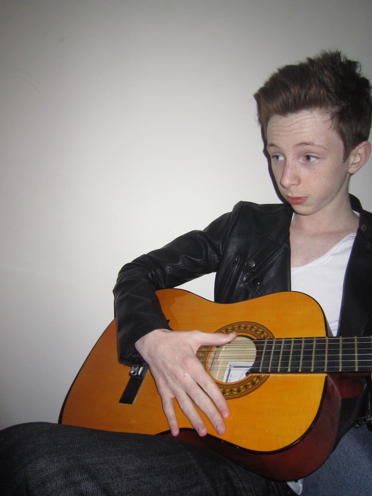
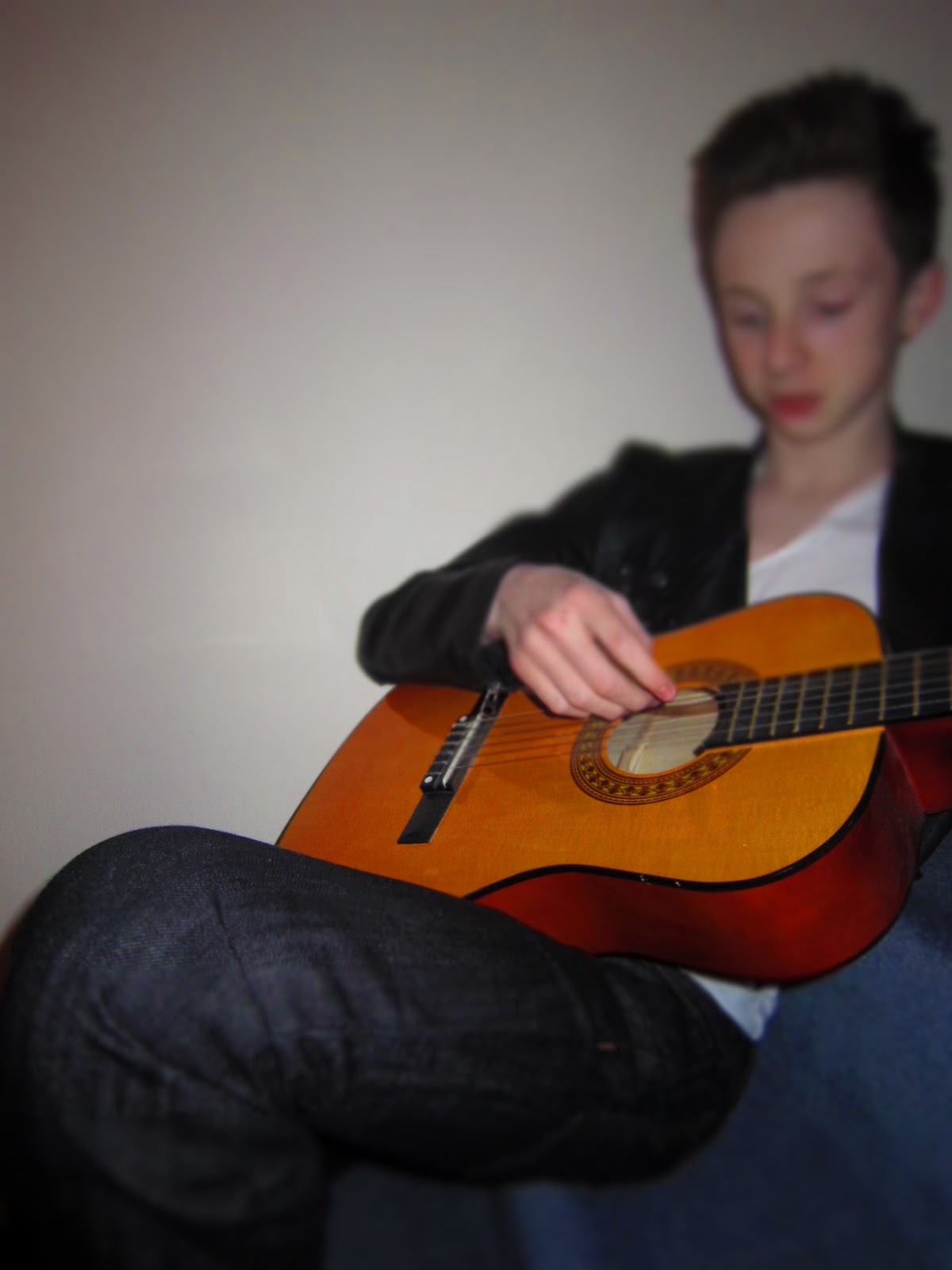
Testing angle

Test Shot

Testing angle 

Begin pouring

The 'money shot'
Now after completing the action photo shoot, I am overall pleased with the end result, although it only ended up being one photo I am proud of it and hopefully I will be able to use this photo in my magazine. 

PHOTO SHOOT WITH BROTHER...

Model: James Gilmore
Camera: Canon IXUS 210
Location: Shifnal

I wanted to take more pictures for my magazine because I didn't think that I had enough of them, this collection of photo's my younger brother is wearing different clothes and it is in a different location.


Experimental Editing... (male model)

Upload desired image to desired web page


1. Magic Wand

By using the magic wand tool, I have managed to edit out the back ground, and I think that the picture actually looks quite good like this, although it wouldn't be appropriate for the contents page.
 

2. Further Gradient Experiment

By experimenting further with the gradient tool on Pixlr I have managed to create a better image than the first with experimenting with gradient. By selecting the shading that you want to change with using the Magic Wand and then changing the back ground with the Gradient tool, which gives this effect.


Experimental Editing... (male model)


Upload a photo to the desired web page

  After uploading the desired image to the desired web page, I will now begin editing the photo, and because I am experimenting with the effects, I will document the different stages.


1. Using text

When selecting what text to use and the font, this selection box comes up.
After establishing what text you'd like.
 
After experimenting with the different types of text on this website, I don't think I'll be using it for my contents page or my double page spread, although perhaps my title page.


2. Gradient

When selecting the gradient this box shows up.
After establishing what gradient you'd like.


PLANNING OF PHOTOSHOOT FOR LITTLE BROTHER...

Considering I want to produce a rock magazine I want me magazine to have a continuous theme throughout; rock, black and white, purple, dark blues, original and humorous. With the photoshoot I wanted to do two, the first being a normal photo shoot and the second being based on action shots to make my magazine look funnier. I am going to take my inspiration from one of my good friends who has his own photographing company and he used the similar action shots.   


This is a picture of the clothes that I got my younger brother to wear for the photo shoot that it not action.

Monday 26 November 2012

Photo Shoot with Male Model

Name: James Gilmore
Location: Priorlee
Camera used: Canon IXUS 210

High Angle camera shot helps the audience to see the cover model at full stance, although I feel that this image makes the cover model look weak, and small.
High camera angle - the change of facial expression helps the audience to appreciate the difference  (between looking weak and not) although, I still don't think that this camera angle compliments the cover model. 

The change of camera angle from a High Angle to a Mid Shot  compliments the cover model more, and gives him a power stance. Also, the use of the prop of a guitar in this particular image helps to establish his stance better. 

The change of mise-en-scene makes helps to establish lighting and makes the cover model catch more light a pon his face. The change of stance also draws the reader in and makes them feel closer to the cover model. 


The change of facial expression addresses the model more to the audience, and gives the reader more of a personal feel with the cover model. The light picks up on the facial features such as the cheek bones and the forehead.


This particular picture hasn't got flash, and the shutter did not close quick enough, which makes this photo a mistake, however  like the way that it has panned out, and the blurred effect on the cover models face looks really original and unique.   


Using an effect on the camera, I have made the guitar look focused and the face of the male model not, this compliments the idea of the music magazine. It also reinforces the fact that it is a music magazine.


Experimenting with different poses, to see if the 'CONTENTS' would fit around the outside of the guitar, as of yet the space looks too cramped and I would have to have a go at editing the picture to see if it would fit.


While waiting for the media camera to be avaliable (for me to complete the photo shoot) I am going to create templates for my magazine front cover, double page spread and contents page, which will hopefully provide me the right direction to head in, and it will keep me motivated to finish the desired product. These templates will also help me to edit my ideas easier in the foreseeable future if needs be.

 
Front Cover
 
 
My initial template for my front cover would be a classic interpretation of a magazine, however as time will go on, I can only assume that I will change my mind and it will become more individual. Although, this gives me a starting point.
Contents page
 
I wanted my contents page to look more individual, and unique. I wanted to use one of the ideas from the Vogue contents page I annotated further down in my blog, and I loved their idea of the 'CONTENTS' on the page to be jumbled up. I wanted to interpret the 'CONTENTS' around a desired image.
Double Page Spread
 
 My double page spread will be focusing on my cover model (female), which my initial idea would be to have her lying on a piano and the image would be situated across the page, and the writing over the top.