Monday, 19 November 2012

Front Cover Research


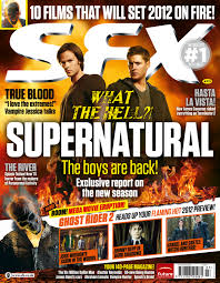
The front cover is supposed to entice the readers to buy the magazine.

Looking at the conventions of a magazine, music magazines have special conventions.
 

The masterhead

The masterhead is the name of the magazine, its usually at the top of the magazine, the eyes are drawn to the top of the magazine and its carefully chosen.

Tagline

The tagline is near the masterhead and it gives more information about the magazine.
 

The central image

The central image is supposed to catch the readers eye, and its possibly the most important feature on the front cover. You also have to think about the connotation and the denotation.

Covermodel

The cover model should be a 'well known' individual who has the power to make people want to know more about them. When analysing think about the mise-en-scene.

Anchorage

The anchorage helps the magazine by providing captions, it links the main image to the story/magazine.


Secondary images

The secondary images help to promote the magazine by showing other things that the magazine has inside it by enticing it.
 

Coverlines

The coverlines are down the side of the front cover, and they give the reader a little 'taster' of what the magazine has inside it; it sums up stories.
Mode of address

The mode of address communicates with individual readers.

Puff/plugs

The puff or plugs help to advertise a compotition, or 'freebies' that you may get inside of the magazine. It advertises these things which helps the public want to buy the magazine.

Pug

The pug is the 'ears' of the magazine, such things like the price, the promotional offer and barcode and they're usually found in the corners of the magazine.

Monday, 12 November 2012


Starting my music magazine 

The research 

What music magazines are there out there? NME, MOJO, Kerrang, Rock Sound, Alternative Press, Babble and Beat, Music Box, Glide, Rolling Stone, Q Magazine, Uncut, The Wire, Sounds and Colours, Rock Rap Confidential etc...
 
What genres is there? avant rock, breakbeat, jazz, modern classical, electronica, ska, pop, R&B, rock, hip hop, rap, surf rock, opera, gospel, alternative, electronic etc...

My genre mood board


My music magazine front cover mood board


Sunday, 11 November 2012

The time management

My time management  for my magazine will need to be really concise due to this i have created a table which will allow me to complete my deadlines on time and it will keep me more organised throughout the project. 


I have set myself strict deadlines that I shall keep to and make sure that my work is handed in on time, and correctly. 

Friday, 9 November 2012

The Evaluation of my front cover and my contents page


I am quite impressed with my front cover; after receiving feedback from my peers and teachers I feel more confident about it, although I do agree with my teachers negative feedback: "I think there is too much dead-space in the middle", and I believe that I will need to take some more photos to put on the magazine front cover. 
I have edited the photo that you can see as the initial back ground of the magazine, which I have taken of the Idsall grounds. I like this photo because the colours make the grounds seam more pleasant and peaceful. I also like the fact that I have managed to get the oak tree into the picture, which is on the Idsall logo, so it makes the magazine look more official. I have also put photo's of the 'competition' that the magazine is advertising, for some costume examples, I think this gives the magazine a more fun side to it as well. I have also placed some illustrated stars and circles on the magazine, which I feel makes it appeal to the younger years more than it already does. 
The fonts that I have used on the front cover I think appeal to the younger generation, and also the language that I have used is playful 'HALLOWEEN IS APPROACHING', this font is also fun. The main title of the magazine has been created on a website called cooltext.com which lets you design your own fonts and use them.  
I am also quite impressed with my final contents page, which I have only received positive feedback from. I have used bright colours to make it 'jump' out of the page at the audience; the colours represent happiness and purity, they're also the Idsall School colours. The pictures that I have used also give the magazine more of an official look to it, and they also show what the contents of the magazine will be about; I think that the pictures are fun and colourful, and this theme goes with the rest of the colour scheme of the page and the front cover. 
The fonts and language on my contents page is very similar to my front page, because I didn't want the readers to suddenly have a shock when the contents page is nothing like the front cover. The subheadings of the contents have also been done on cooltext.com, I feel this gives the magazine more of a playful theme to it, and it's providing the readers with more to look at than just the same fonts and colours throughout the contents page. 

Advertisement


After considering many different ideas for my advertisement I have decided that I am going to advertise the Six Form, and I am going to use this image above. I think that advertising the Six Form will appeal to most readers of my magazine, because it will give the younger readers an opportunity to consider what they are going to do in their future and the elder readers will be able to see what six form their children go to or what their younger children may go to.
After properly considering doing another page for my school magazine I feel that it has given me a more conceptualised view on what I would have to do with my music magazine, and I now feel almost ready to produce my magazine. 

Monday, 5 November 2012


Considering ideas


I could advertise the sports centre, and this photo compliments the sports centre with the pupils work. I would crop out most of the brick work on the edges of the picture, leaving a fine boarder of brick work. I would have to produce better images I think.

I may use this image to advertise the sports hall, and the sports centre. This image shows the mass of space we have at Idsall School.

 I could use this image to advertise the art department and/or the music department. I think that this is a really good piece of work and that it also shows the talent that we have at Idsall School.


Ideas for advertisement

I have taken a few pictures which may be useful for my advertisement. I am highly considering advertising the six form and what it has to offer, however right now I am experimenting with various images and seeing what fits together.
I have taken this photo of the outside of six form, and it is a close up of the title; the use of the clear blue sky personifes the six form as a happy and peaceful place, it also may show that you can think clearly here and its easy to study. The use of the colours blue and green give the audience a natural feel to the six form.

This picture is a long shot of the outside of six form, and it gives us more to look at, and think about. I think that this picture makes the six form look like a happy place, more so than the last image, and I have also got the grass and some trees into the image, which gives more of a natural feel. I think that this picture compliments the six form and the school.